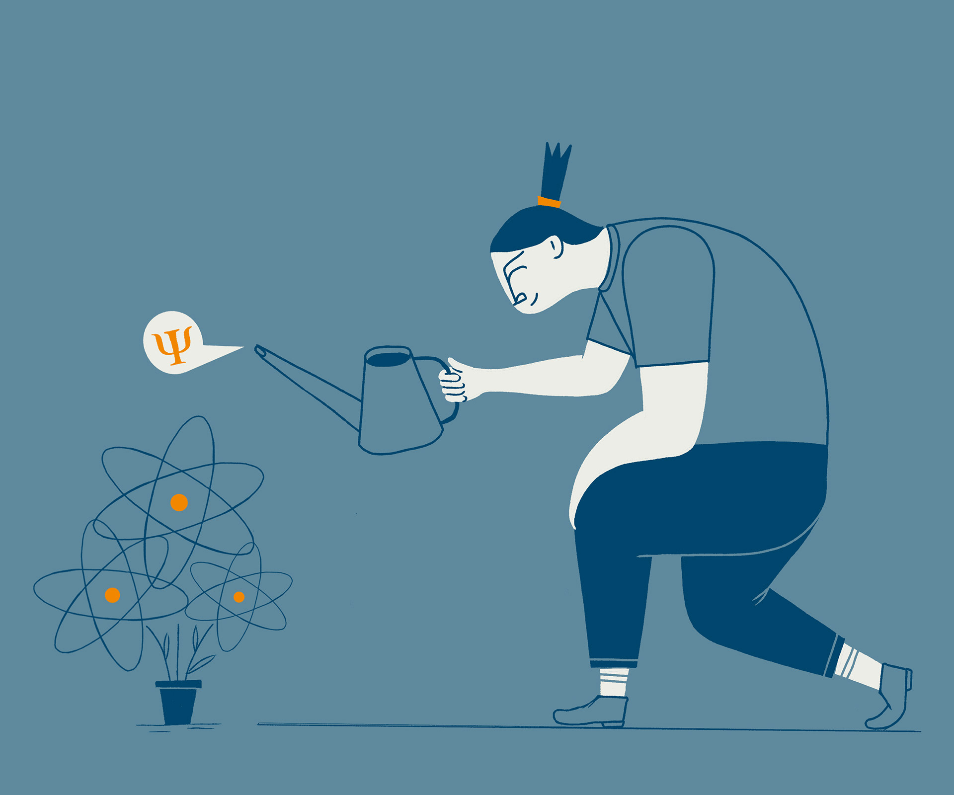
Landing page design and corporate illustrations for an online academy focused on quantum information. The challenge: speak of quantum physics without resorting to clichés. The brief came with a fixed color palette, the need for gender-neutral visuals, and a series of portraits of the Academy's directors. The atom—an overused but unavoidable symbol—was reimagined and subtly woven into everyday scenes: a bicycle wheel, the outcome of a cat’s cradle, a plant being nurtured. The goal was to shift perception, suggesting that quantum ideas, while complex, can grow in familiar soil. A visual identity that aims to be clear, human, and quietly surprising.


